Photography is about personal expression and the creative process allows us to make many choices, including the choice of a format of photographs. Many landscape photographers prefer standard horizontal format, so well suited for landscapes. Others choose vertical, panoramic or square. There is not one, ‘ideal format’ and even when the preference is strong, it may not be suitable for all our photographs. However, wisely chosen format, one that suits your style, can significantly change your artistic direction and give you freedom, not restrictions. For me, the most favourite format is a square. I started to “see in the square format” very early, when I was a child. I used to play with my father’s Pentacon Six, a 6×6 film camera; the camera was cumbersome and difficult to hold in my small hands, so I got bored with it and embraced more modern cameras. With modern, high megapixels cameras, I started again to crop images square and still print them big.
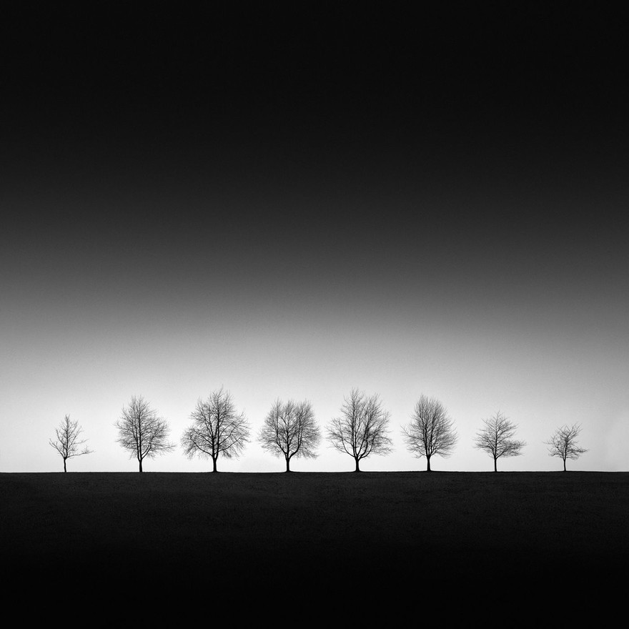
A good example, why I am very fond of the square format, is an image by Patrick Ems, ‘Linearity’. A square format here with darker ground and sky “hugs” the image, giving it the quality of stillness and this rather difficult to explain, neatly “boxed” feeling. The peaceful precision of this winter or perhaps early spring scene captivated me with the vast negative space and trees position very low in the frame. I see the trees dotting the bare landscape as perfect imperfection – perfect in their similarity, but imperfect in their shapes, which adds variety and keeps our interest.

When creating square images, a sense of order and harmony is very important. The way we look at squares is different from rectangular images. All the sides of a square have an equal weighting and our eye moves around the frame in a circular motion rather than linear. The square format is ideal for central placement, but also for placement near any edge of the frame, a very welcome freedom when composing. One more factor in favour of the square format is that it appeals to photographers who exhibit their images in galleries. Square images look good on their own, and also when placed in sets of two or three. Let’s hope this year will bring many opportunities for those who plan some exhibitions; after a very bad year for artists, we need to see beautiful images on the walls of the galleries!
Beata Moore
Discover. Experience. Create

