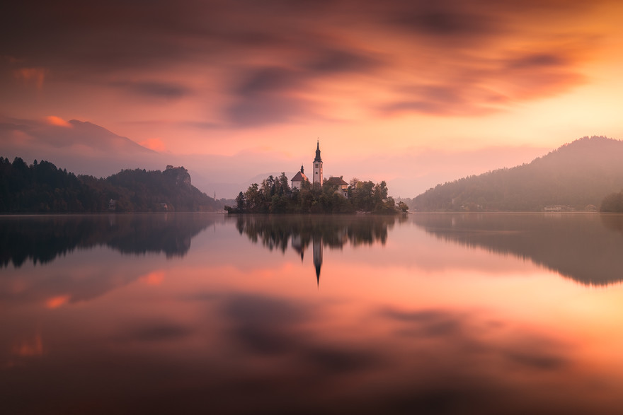
As landscape photographers, we are acutely aware of the power of symmetry in our images’ composition. Symmetry is a tool allowing us to add harmony, clarity and balance. Asymmetry (in simple terms, breaking an established pattern) can be just as useful as symmetry. It guides the eye through a picture to the point of asymmetry and introduces a powerful mood of tension. As a landscape and architectural photographer, when I think about symmetry and patterns, my first thoughts go straight to architecture and design. However, symmetry is found everywhere in nature and landscapes too. Symmetry is natural, one can find it in flowers, as many have a circular pattern, in all water reflections centred around one central axis line, patterns of spider webs, shells, honeycomb, butterflies and snowflakes, to name a few. The answer to the question why we are drawn to symmetry is complex. Most probably, throughout human history, our brains developed positive response to symmetry and patterns as they were easier to interpret. A certain order and simplicity made our ancestors feel safe, and us, more comfortable.
‘Lake Bled’ by Andrea Liviari is a perfect example of pleasing symmetry, balance and proportions. Received wisdom of not positioning the horizon half way up, was thankfully rejected giving us this perfect, horizontally mirrored image. The church positioned like in a fairy tale, in the middle of an island, and mist swirling around the distant hills, makes this image incredibly evocative. The image however breaks a little bit vertical symmetry with its uneven line of the hills to the left and right of the church, and that allowed photographer to add to the image, a sense of visual tension and aesthetically pleasing imbalance.
I like symmetry a lot, as it represents simplicity and elegance, it also creates a sense of visual cohesion. Let’s not however forget about asymmetry when composing images, as its greater gift is vibrance, flamboyancy, even a sense of adventure. Don’t be afraid to break established patterns and draw viewers’ attention to a particular element of your landscape, as not all of the images have to be clean, quiet, proportional and balanced.
Beata Moore
Discover. Experience. Create.


